

Project Overview
Users in Turkey are facing too many problems and difficulties with the current practices for the ads directory. The current mobile apps or web applications are not usable and easy to use. BM team decided to change everything and build a mobile app in order to satisfy the end users.
Project Goals
Baba Melki or BM mobile app is an online ads directory which feed the users in real-estate, cars, shops and daily tasks categories. Its user-friendly and usable design will make end users happier than ever before!
My Position
UX/UI designer
Project Duration
Jan 2020 - May 2021
Tools
Figma
miro
Target Groups
Landlords, tenant or car owners looking to sell or rent
Buyers (for property, cars, or goods)
Tourists seeking services such as purchasing or renting property or cars
Real estate agents and car dealerships
Goods sellers
Service providers
Organizations with employment advertisements and their requirements
Design Thinking Process

01
Research
we initially conducted field research which included interviewing key stakeholders, competitor analysis, focused group discussion and digital survey. Additionally, we performed the usability test method to gain an understanding of the current users who adopt mobile apps such as Sahebinden, Getir and trendyol in istanbul city. We aimed to understand our users better in order to find their pain points.
stakeholder's interview
1.
some of its services are given below based on the stakeholder's interview and finally three main services were selected for the MVP:
• Real-estate services (MVP)
• Cars (MVP)
• Shops directory (MVP)
• Services directory like : lawyers, teachers, barbers, hairdressers, baby sitters, photographers, cleaners, gardeners and repairmen
• Financial services
Digital Survey
2.
We sent a digital survey to 120 individuals from both Iran and Turkey, and the following results were obtained.

Competitive Analysis
3.
Detailed competitive analysis was carried out to identify BM App competitors and detemine their major strenghts and weaknesses.

Focused Group Discussion
4.
We conducted a focused-group research session with 25 members (3 groups, each group consisting of 8 members). Some issues and topics were raised in order to gather the candidates opinions about the regarding problems in the current practices such as Divar App, Achare ، Ostadkar App, and some other famous mobile apps. The results of which is give below:
The application being quick, usable, and beneficial for property sales
Reduction in calls due to the ability to select the type of ad viewer
The annoyance of frequent calls from real estate agencies
The usefulness of the in-app chat feature
Dissatisfaction in the employment section due to the absence of job applicant level determination
Successful experience in buying new or second-hand goods, along with satisfaction from payment after an examination of the product
Purchasing a product during an astonishing discount
Reduction in commission payments to real estate agencies
Insufficient information about the advertised property, such as bedroom dimensions, the type of neighborhood and its accessibilities
The application being quick, usable, and beneficial for property sales
Unsuccessful product sale due to misplaced trust in the buyer, delivering the product before the buyer's payment, and lacking valid information about the buyer
Usability Test
5.
At this stage of the research, in order to identify the needs and pain points of users and better understand them through the use of existing applications in the Turkish market, we conducted in-person usability tests on two users, one Turkish and the other an Iranian tourist. For this purpose, 3 simple tasks were set.
Tasks users:
• Open up the app and simply look for (Search Bar) the offers in your desired neighborhood
• If you find nay matches, get the ads information and try to reach the owner
• Tell us your experience in details and tell us about its filtering feature
Poor design of the filtering section and not achieving the desired result
Complexity of the login section
Various and complex paths to reach the user's goal
No display of the language change icon and its inaccessibility for foreigners
Poor display of the details for each advertisement, especially for foreigners
Poor design of the filter based on neighborhoods
Lack of confidence in the advertised price
Unclear navigation design
Lack of translation for the details of the ad and different sections like categories, leading to a bad user experience for tourists
The advertiser and the date of the advertisement are not visible at first glance
Persona
6.
Based on the results of the user research and identifying common pain points among users, we created several personas to aid in ideation. This was a very useful tool for finding mutual understanding between the client and the product and design teams.

02
Define
Throughout our research, we discovered that our end users (both Turkish people and tourists) are looking for a mobile app and service which is very easy to use, enables them to even message the ads owners, and informs about the ads feature in a clear an concise way. In addition, we found out that those who are looking to buy a new car are really sensitive and fussy about the ads detailed information. So, visualized ads features could definitely satisfy our future end users.
Simplicity
During the competitive analysis we found out that current apps such as Tendyol, Getir and Even Sahebinden who are currently giving services in istanbul are very complex and their users are not truly satisfied with its services.
Ads information
We found out that users prefer to read more about their favorite ads information in a pretty modern and visualized way. Many interviewees believed that some visualization would be definitely much more attractive for them.
Ads posting
It turned out that current users are quite worn out with the complex and long forms to be filled while posting their ads in the current apps. They really wanted a service to post their ads very fast, easy and get the most visitors at the first hours.
03
Ideate
Due to the vastness of the subject being studied and the diverse categories, it was decided to initially create the product's MVP with three categories: real estate, cars, and product buying and selling. This was to address the needs and pain points of the user that they face in everyday life and while working with existing apps in the market. As a team, we identified ideas and solutions, listed all items, and prioritized them. In the first phase, it's crucial to design a user-friendly application that meets the primary needs of both local and foreign users. They should easily be able to view listings and their details in their preferred language, and the option to post a listing should be effortlessly available.
Some ideas for the second version features:
To reserve a 3D or in-person tour to view properties.
The option to reserve a local place for office meetings, which is very useful for foreign users who are not familiar with the Turkish language, as well as advertisements for upcoming events.
Specifying rent and monthly building maintenance costs.
Making monthly rent payments within the app.
The ability to view addresses and different branches of shops, and to rank them, helping buyers make better and more confident purchases.
The option for an in-app down payment when buying products.
User Flow
1.
In designing the User Flow, we used Miro to collaboratively and online map out the specific and tangible steps that a user takes to complete a certain task or achieve a particular goal. This helped us move towards an integrated product. However, after wireframing, we occasionally had to revisit the User Flow and rearrange, delete, or add a few tasks.

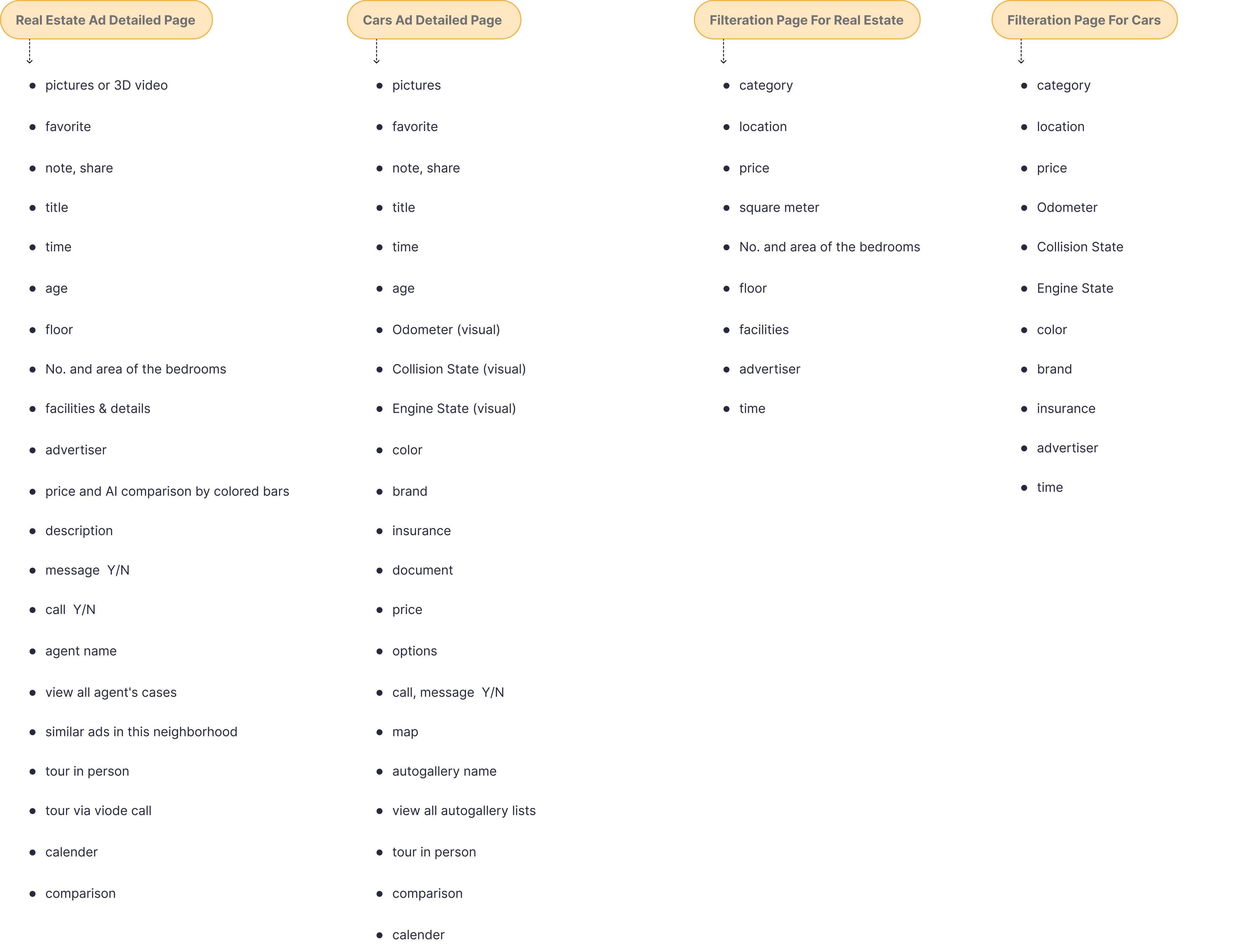
Information Architecture
2.
04
Prototype
Low-Fi wireframe
1.
At first, each team member sketched with a different perspective based on the User Flow in the Miro tool. then we used the Crazy 8 method to determine which parts had majority agreement and then progressed to the Wireframe.
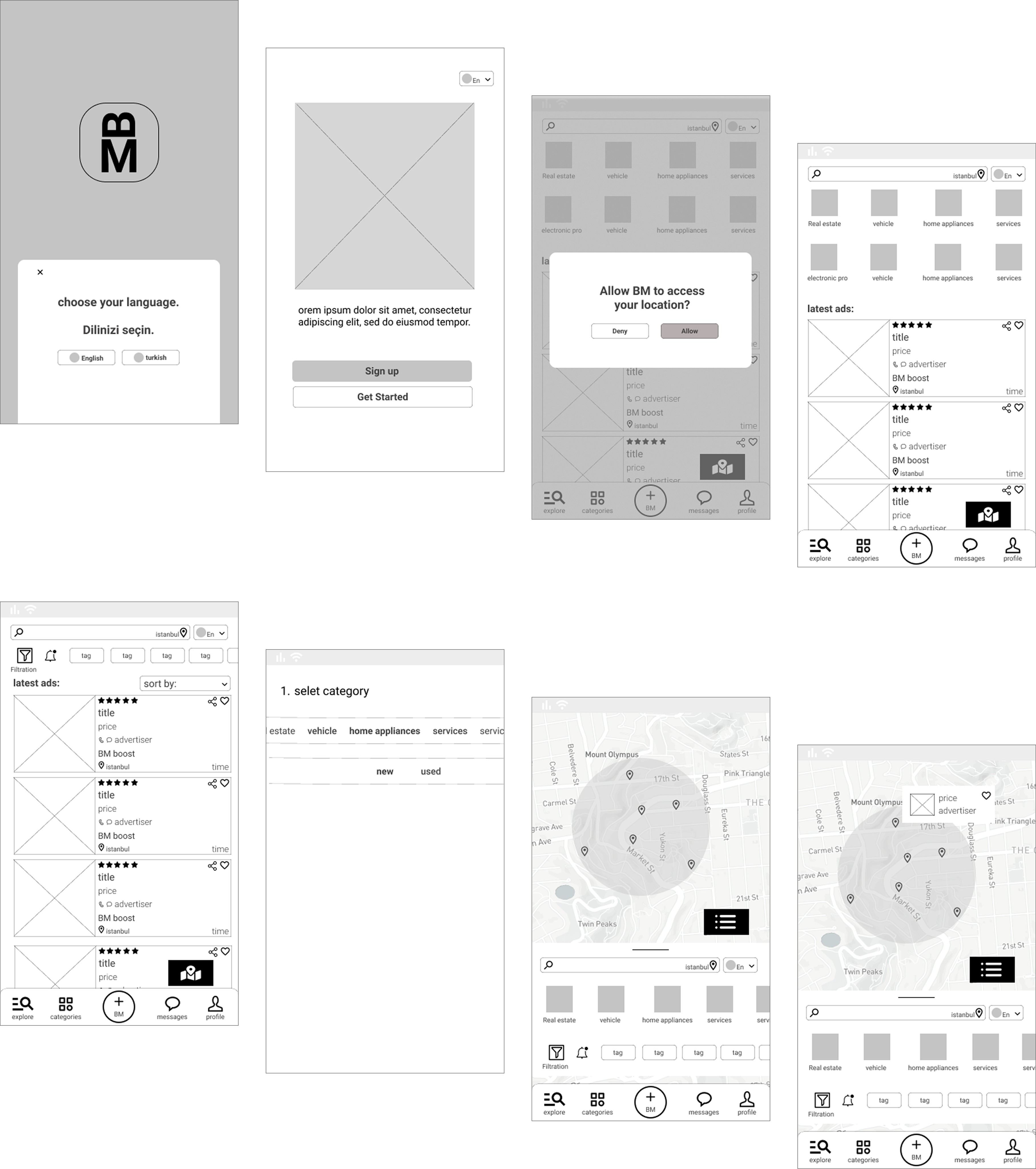
Hi-Fi wireframe
3.


prototype
4.
We needed to prototype the designed pages to test with users in-person. Also We tried to demonstrate the main pages of the BM mobile app to the stakeholders and the development team.
05
Test
Usability Testing
1.
We selected three simple and short tasks for users and tested the application in person with 6 users. We asked users to think out loud while using the application.
Tasks users:
1.
Sign up
First, select your language and sign up in the application.
1.
Choose your product
Find the product listing you are interested in, and if you choose the desired product, contact with the product's seller.
1.
Post your advertisement
Create an advertisement for your product and post it.
The usability test had the following results, and the users' feedback at the end was that the application is designed simply and is understandable.
Easily filter your home feed
In BM, searching and feed result is more than a great experience. Users can easily filter their results and even save their search preference for future suggestions.
Get the ads Gist in a minute!
Every information is organized, clean and very easy to get. The most important features are visualized for the users comfort. Easily get connected with the owners.
Ads posting is fun
From now on, ads posting is not pain in the neck anymore! Our usability test result shows that ads posting average time improved by 60% ending with happier users.